To date, we have been working on some very exciting brand design projects for some of our newest clients.
Firstly, we’ve been creating graphics for the new Hampshire Independents party, which launched late last year.
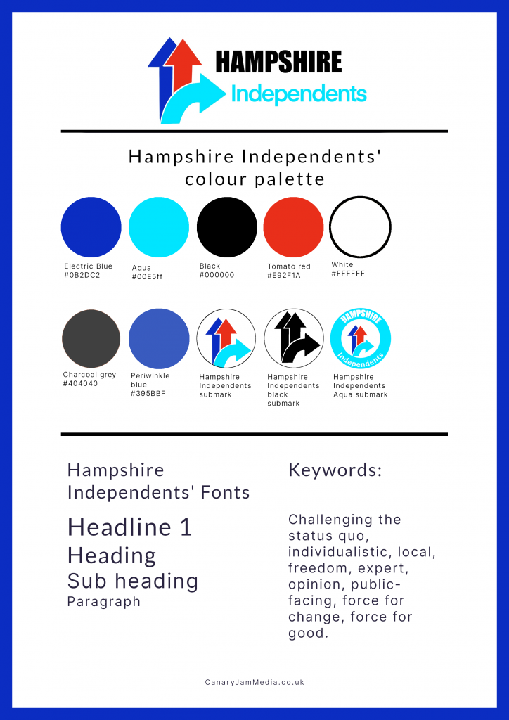
The brand design brief
Their brief was to create a series of graphics which could be used as templates for them to use on social media.
Before we embarked on this project it was pretty clear that they needed a brand identity guide to keep the designs consistent. So together with their team, we created a new guide for them which includes their fonts, brand colours and logos. We’ve also helped them to refine their sub marks; which are logos that are adapted for different uses.
The main advantage of having lots of different types of logos and submarks is that the brand's logo can be adapted for a wide variety of purposes. From social media to use as a letterhead, your logo needs to scale and fit correctly within the different parameters. If you only had one logo then chances are it would scale incorrectly, and would most likely be cut off. This would look awful!
Brand identity design for the Hampshire Independents.
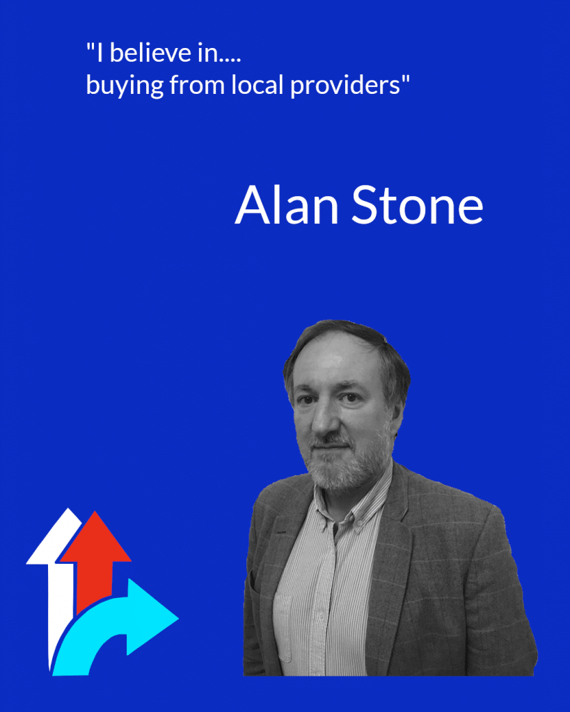
Alan Stone, Leader of the Hampshire Independents
Scott Neville, Nominating Officer and Party Administrator of the Hampshire Independents
Over the course of the project we referred to their recently launched website, as it has been designed to differentiate themselves from their competitors. The dark theme makes them stand out as it is unusual. Colour also plays a very important role within the political landscape, as it helps to distinguish the different sides. The messaging and values which underpin this party are unique, because they decided to join forces as the current system makes it very hard for independent candidates to stand.
Colour psychology and its impact on brand design
As you can see by the visuals, we have successfully produced a branding guide to help them to communicate their key messages and overall brand story. Their brand colours are predominantly blue; which is the colour of communication and truth. Red meanwhile is the colour most commonly associated with power, energy, strength and success. White symbolises purity/freshness and black is seen as an authoritative and business-like choice (Henderson and Henshaw, 2006). The two extremes of black and white (dark and light) provide a beautiful contrast to the other more vibrant colours.
We have developed a colour palette which will work both online and in print, and will communicate their key value of independence (from the main political parties). The keywords associated with their brand are: challenging the status quo, individualistic, local, freedom, expert, opinion, public-facing, force for change and a force for good.
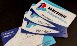
Brand Design for the Hampshire Independents: their new membership cards as designed by us
If you’re interested in developing your brand identity then come and speak to us. We have a friendly team of brand design experts who will be delighted to assist you.
References
Henderson, V. & Henshaw P. (2006) Colour Me Confident. London, Octopus Publishing Group Ltd.
Slade-Brooking, C. (2016) Creating a Brand Identity A Guide For Designers. London, Laurence King Publishing Ltd.
We use cookies to ensure that we give you the best experience on our website. If you continue to use this site we will assume that you are happy with it.